Shooting Lomochrome Purple on the Mamiya 645 Pro – Finding the Right Subjects
An experiment with Lomography's unusual colour-shifting film, a familiar Devon woodland, and the importance of choosing subjects that suit the film.
Beyond the novelty of purple film
When I first started experimenting with Rollei Infrared 400, I quickly discovered that the most interesting photographs weren't necessarily the traditional infrared landscapes. We've all seen those photographs of bright white trees against almost black skies. They can be beautiful, but I found myself drawn towards subjects where infrared film produced something less predictable.
Certain woodland scenes, particularly those with interesting shapes and textures, took on an almost painterly appearance. Some reminded me of traditional Japanese paintings, with their delicate tones and unusual separation of foliage.
That experience got me thinking about Lomography's LomoChrome Purple.
I'd seen plenty of photographs taken with this unusual colour film, some of which had an almost psychedelic appearance. I'd also read comparisons with Kodak Aerochrome, the legendary infrared colour film that produces those extraordinary pink and red landscapes.
Of course, LomoChrome Purple isn't an infrared film, and the way it produces its colours is quite different. Nevertheless, those similarities interested me.
I wasn't particularly interested in photographing an ordinary landscape and simply turning everything purple. I wanted to find subjects where the film's unusual colour rendering would genuinely contribute to the photograph.
The challenge was finding those subjects.
Returning to Blagdon Rings
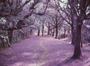
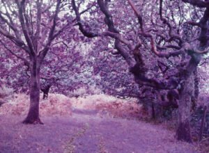
For my first roll, I decided to return to Blagdon Rings in Devon, a location I've photographed before and know reasonably well.
There were several practical reasons for choosing it. It's only a short walk from the car park, has plenty of interesting woodland, and is an excellent place to take the dog for a walk.
But there was also a particular tree I wanted to revisit.
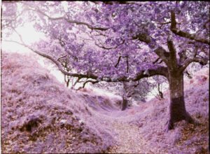
On an earlier visit, I'd photographed a Japanese-looking tree using Rollei Infrared 400 and produced one of my favourite photographs from that roll. The combination of the tree's shape, surrounding foliage and infrared rendering had worked particularly well.
I wondered what would happen if I photographed the same tree using LomoChrome Purple.
The weather was overcast but dry, with the sun occasionally threatening to break through the clouds. It wasn't particularly dramatic light, but I thought the relatively subdued conditions might help produce the more delicate colours I was hoping for.
I loaded my Mamiya 645 Pro with a roll of LomoChrome Purple 120 film and set about exploring the woodland.
Shooting at ISO 200
LomoChrome Purple offers a fairly wide exposure latitude, with Lomography recommending an ISO range of 100 to 400.
I decided to shoot at ISO 200, roughly the middle of that range.
My reasoning was fairly straightforward. I wanted to avoid some of the more extreme colour shifts and hopefully produce something a little more muted.
I also bracketed a few photographs, shooting one stop above and below my chosen exposure, to see how the different exposures affected the final colours.
I didn't use any filters.
Although I'd considered experimenting with a polarising filter, I wanted this first roll to give me a better understanding of the film itself without introducing another variable.
Learning to look a little closer
One of the more interesting moments came when I found myself looking at a group of trees.
Initially, I wasn't particularly inspired.
In fact, I remember thinking that I wished I'd brought a roll of Kodak Portra instead. The scene had some lovely natural colours, and I could imagine how well they might have worked on a more conventional colour negative film.
But rather than moving on, I started looking more closely.
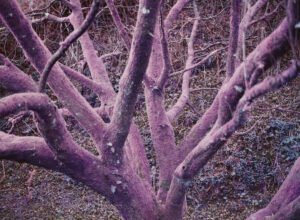
Instead of seeing the trees as a group, I began concentrating on the individual branches, the shapes they created and the subtle variations in the leaves.
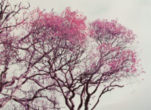
There were some wonderfully gnarly branches, with delicate foliage silhouetted against the pale sky.
I wasn't entirely sure how LomoChrome Purple would interpret the scene, but there was enough interest in the shapes and textures to make it worth a photograph.
As it turned out, this became my favourite image from the entire roll.
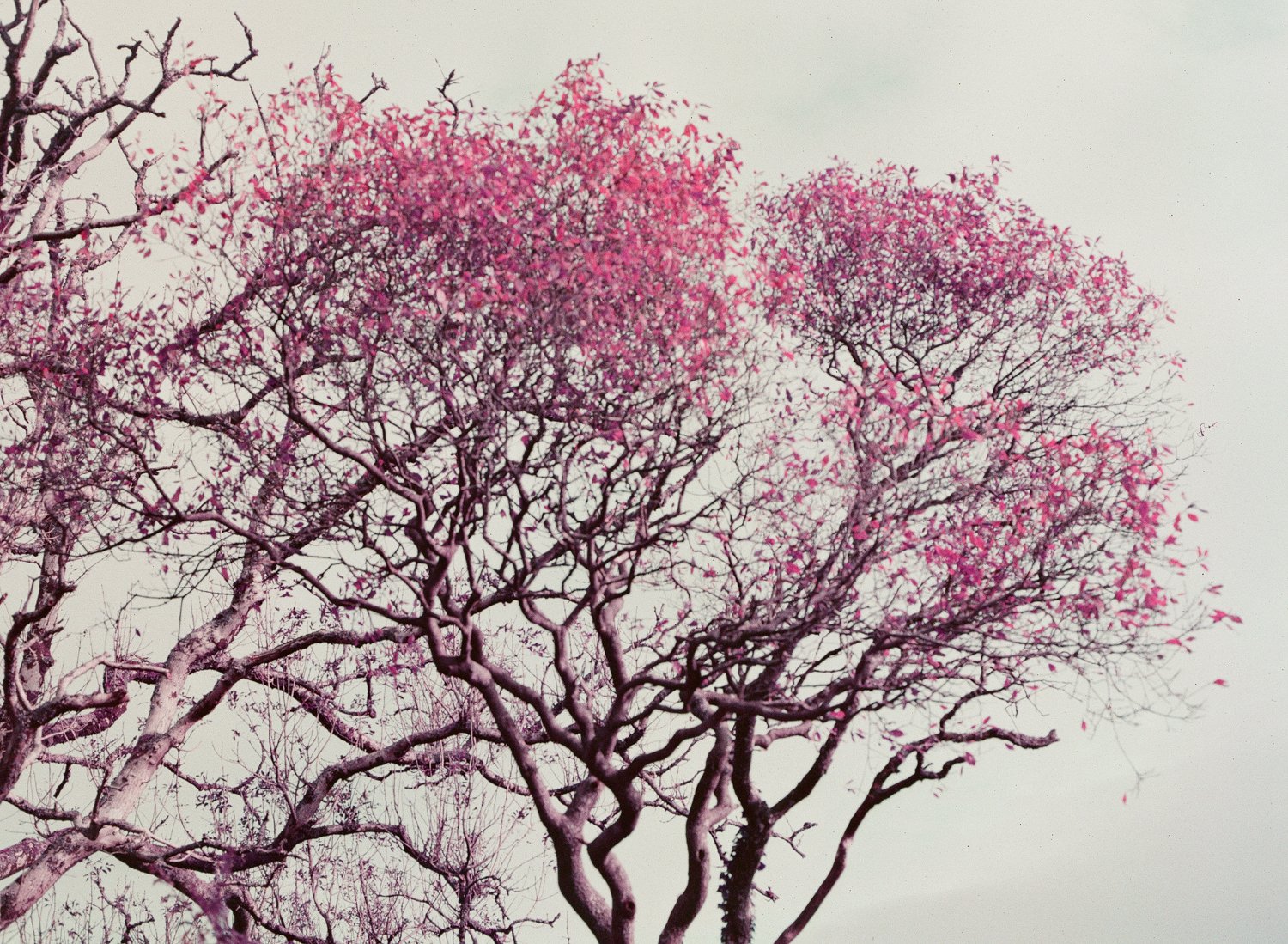
What I particularly love about this photograph is its delicacy.
The leaves have taken on a beautiful pink-magenta colour, while the sky has become a soft, creamy grey. The branches provide structure without overwhelming the image.
There's something almost Japanese about the result, not because I was deliberately trying to imitate a particular style, but because of the simplicity of the composition and the way the colours work together.
It also has something of that Aerochrome appearance I'd hoped to explore when choosing the film.
And yet it doesn't feel particularly artificial to me. The colours are clearly unusual, but they seem to belong together.
It's a photograph I might easily have overlooked had I been concentrating on the wider woodland scene.
Revisiting the Japanese tree
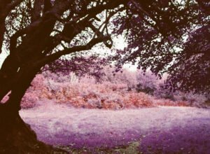
Naturally, I also returned to the tree I'd previously photographed on infrared film.
I'll admit I was a little lazy with this one.
Rather than spending time exploring different compositions, I largely recreated my earlier infrared photograph. I already knew the composition worked and was curious to see how the two films would interpret the same subject.
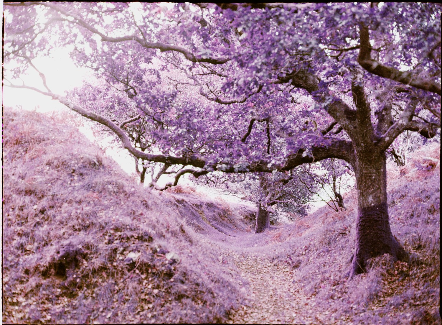
I really like the result.
The unusual colours give the tree a different character, and once again the combination of shape, foliage and film produces something rather painterly.
However, if I had to choose between the two photographs, I'd still favour the infrared version.
That's not a criticism of LomoChrome Purple. If anything, it reinforces what I've been learning through these experiments.
Different films suit different subjects, and even when the composition remains almost identical, the character of the photograph can change considerably.
The infrared version simply works better for me.
A few photographs closer to home
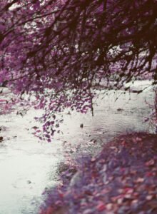
I also used part of the roll to experiment with some riverside scenes much closer to home.
In fact, the river is literally about twenty seconds from my doorstep.
It's somewhere I'm very familiar with, which makes it an ideal place to try different photographic ideas without having to travel anywhere.
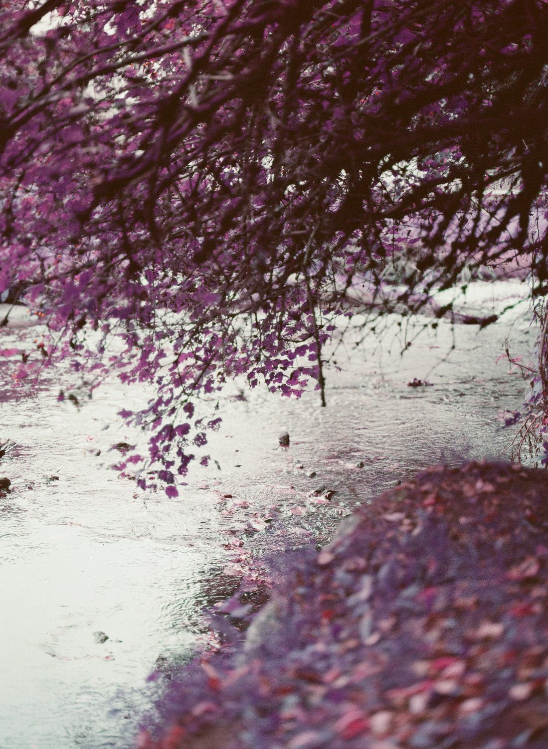
These photographs were interesting, although I don't think I've quite discovered the best way to use LomoChrome Purple in this environment yet.
What caught my attention was the potential of the water, reflections and surrounding vegetation.
There are possibilities here that I hadn't fully considered before shooting the roll. Different compositions, reflections and perhaps different lighting conditions could produce some genuinely interesting results.
Rather than considering these photographs unsuccessful, I see them as a starting point for further experimentation.
I suspect there's a great deal more to discover.
Scanning LomoChrome Purple isn't straightforward
After having the film developed and scanned by the lab, I also made my own scans using my Fujifilm GFX100S II and home film-scanning setup.
Normally, I prefer working from my own scans. They give me more control over the conversion and allow me to work with a high-resolution RAW file.
However, LomoChrome Purple has proved surprisingly difficult to get right.
Small changes in colour balance can have a considerable effect on the final image. The relationship between the magentas, purples, greens and more neutral areas is particularly tricky.
On this occasion, I actually preferred the colours produced by the lab.
I've been experimenting with Negative Lab Pro and Lightroom Classic, and I'm getting much closer to matching those results, but I'm not quite there yet.
It's an interesting reminder that having more control over an image doesn't automatically mean producing a better result.
For now, I'm happy to acknowledge that the lab did a better job with the colours on this particular roll.
Was Lomochrome Purple worth trying?
Absolutely.
What surprised me most wasn't necessarily the unusual colours, because I already had a reasonable idea of what to expect from the film.
It was how much the experience encouraged me to look differently at familiar subjects.
I went into the shoot knowing that I didn't want to produce a collection of conventional landscapes with purple foliage. I wanted to find compositions where the film's characteristics would make a meaningful contribution.
Some photographs worked better than others, but there wasn't a single frame on the roll that I'd consider a complete failure.
Even the images I wasn't entirely satisfied with offered ideas worth exploring further.
The photograph of the leaves against the creamy grey sky is undoubtedly my favourite. It's delicate, slightly surreal and has that wonderful quality of being recognisable as a woodland scene while looking quite unlike anything I'd normally photograph.
The Japanese tree worked well too, although I still prefer my earlier infrared photograph.
And the riverside images have left me wanting to experiment further with reflections and the interaction between water and foliage.
What next for Lomochrome Purple?
I'm certainly not finished with this film.
In fact, I'm hoping to shoot another roll in a couple of weeks when I attend a photography workshop on Dartmoor.
That should provide an opportunity to explore some different subjects and perhaps a different approach to composition.
What this first roll has reinforced is something I began discovering with infrared photography: an unusual film doesn't necessarily make an interesting photograph.
The subject still matters. The composition still matters. And perhaps most importantly, understanding what a particular film can bring to a scene matters.
I think I've only scratched the surface of what LomoChrome Purple can do.
And that's probably the best reason to load another roll into the Mamiya.
0 Comments